Aki-To
Brand Identity
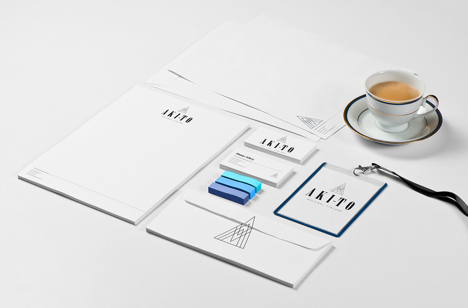
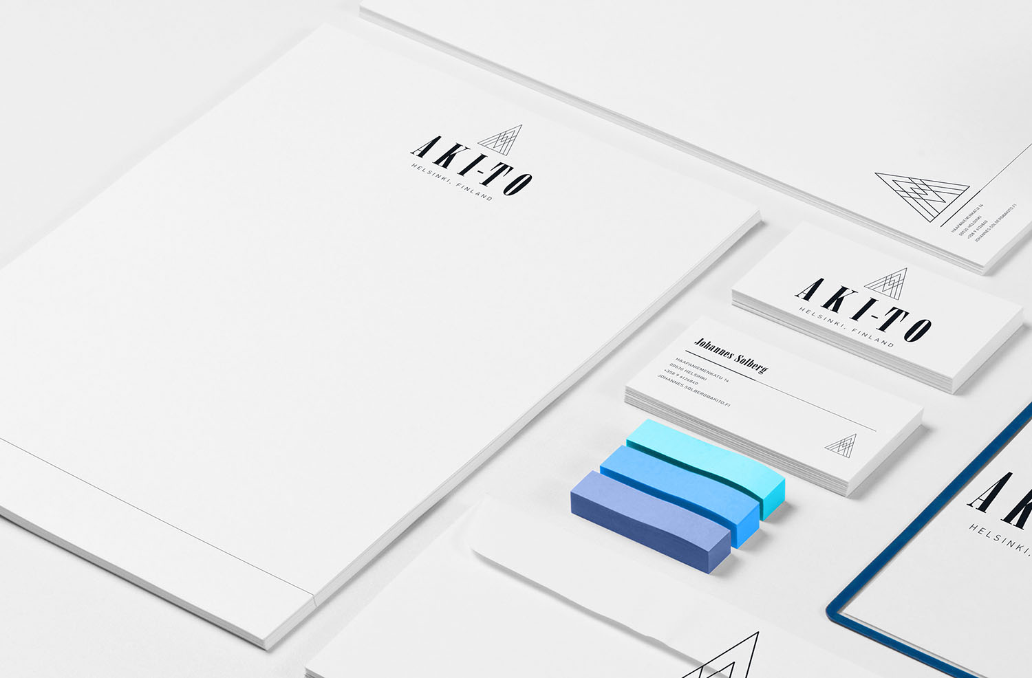
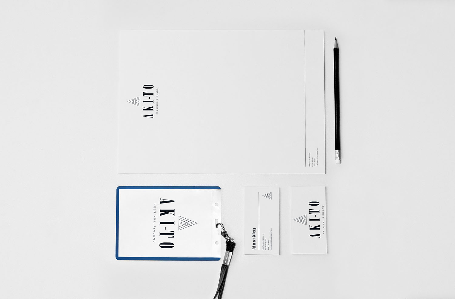
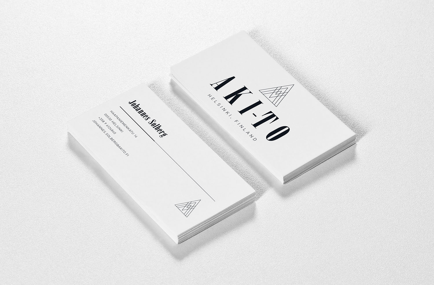
Aki-To is a fictitious luxury hotel in Helsinki, Finland owned by two creatives who need a new brand. The brand should reflect what the company itself offers and accompanied with a style guide. The brand needs to be crisp, simple, and cool.
The solution to the problem was creating a pictogram that embodies the brand and the surrounding land. The pictogram takes a simplified mountain and the letter "A". It is juxtaposed against a bold slab-serif typeface to weigh it down.


Filmfriend
UI/UX
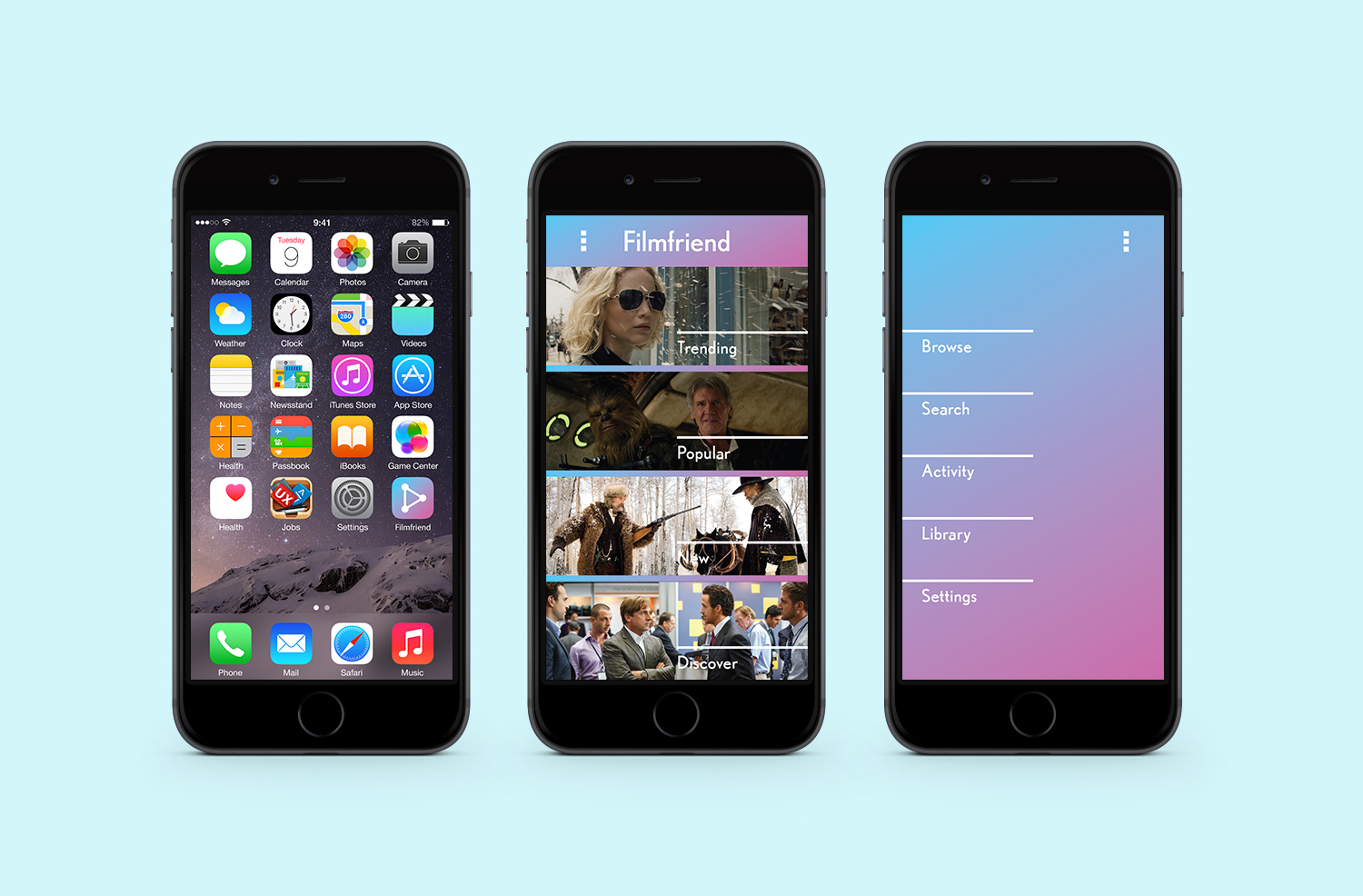
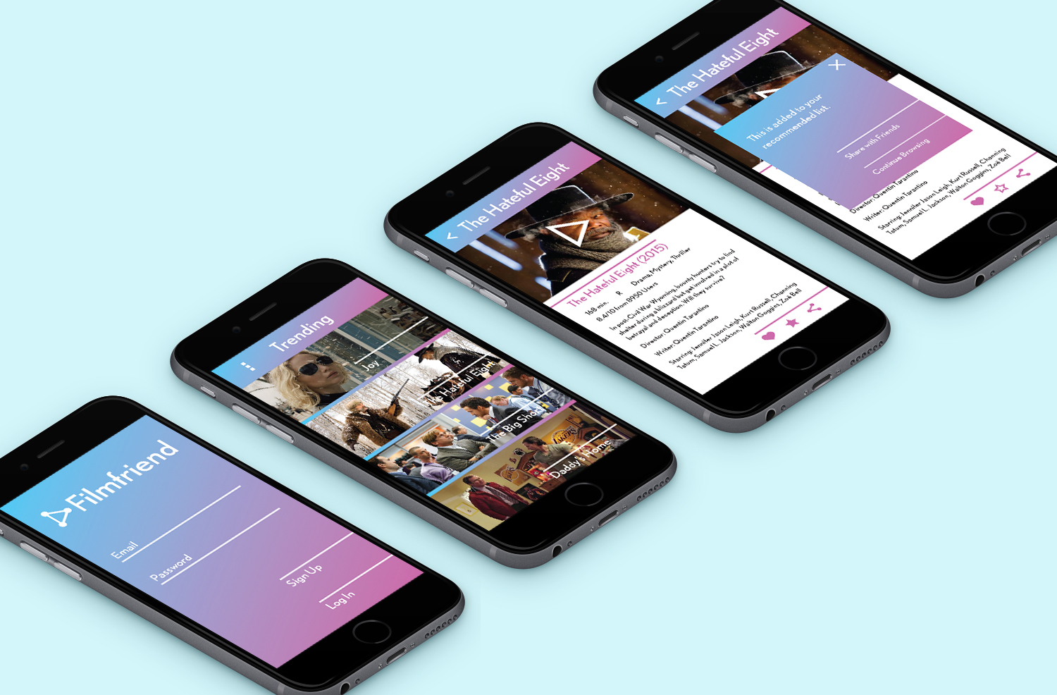
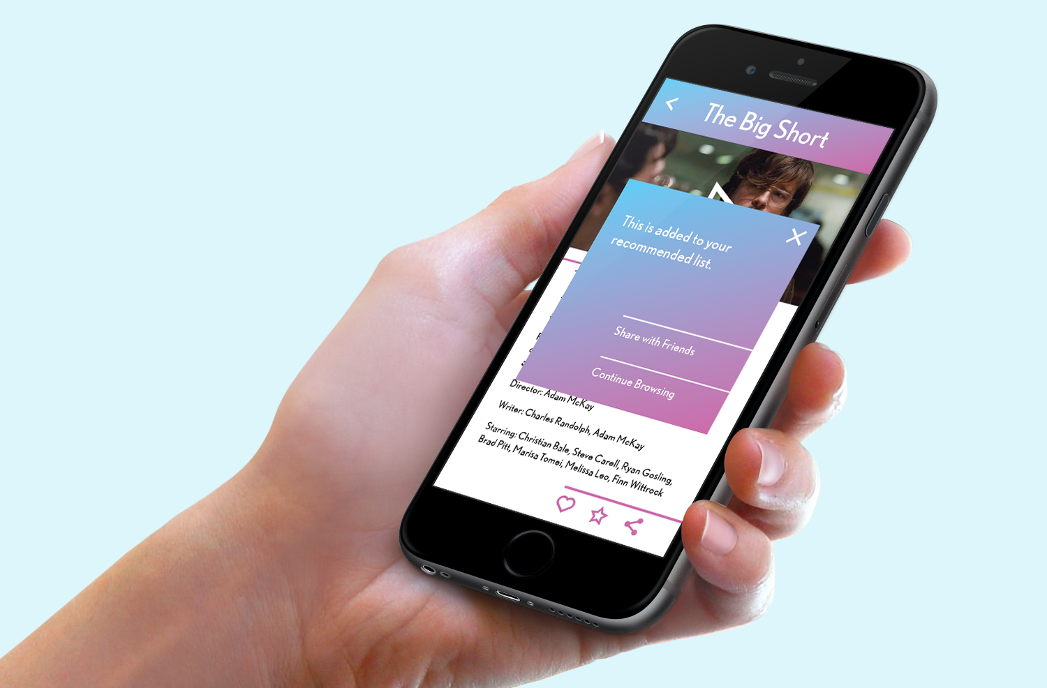
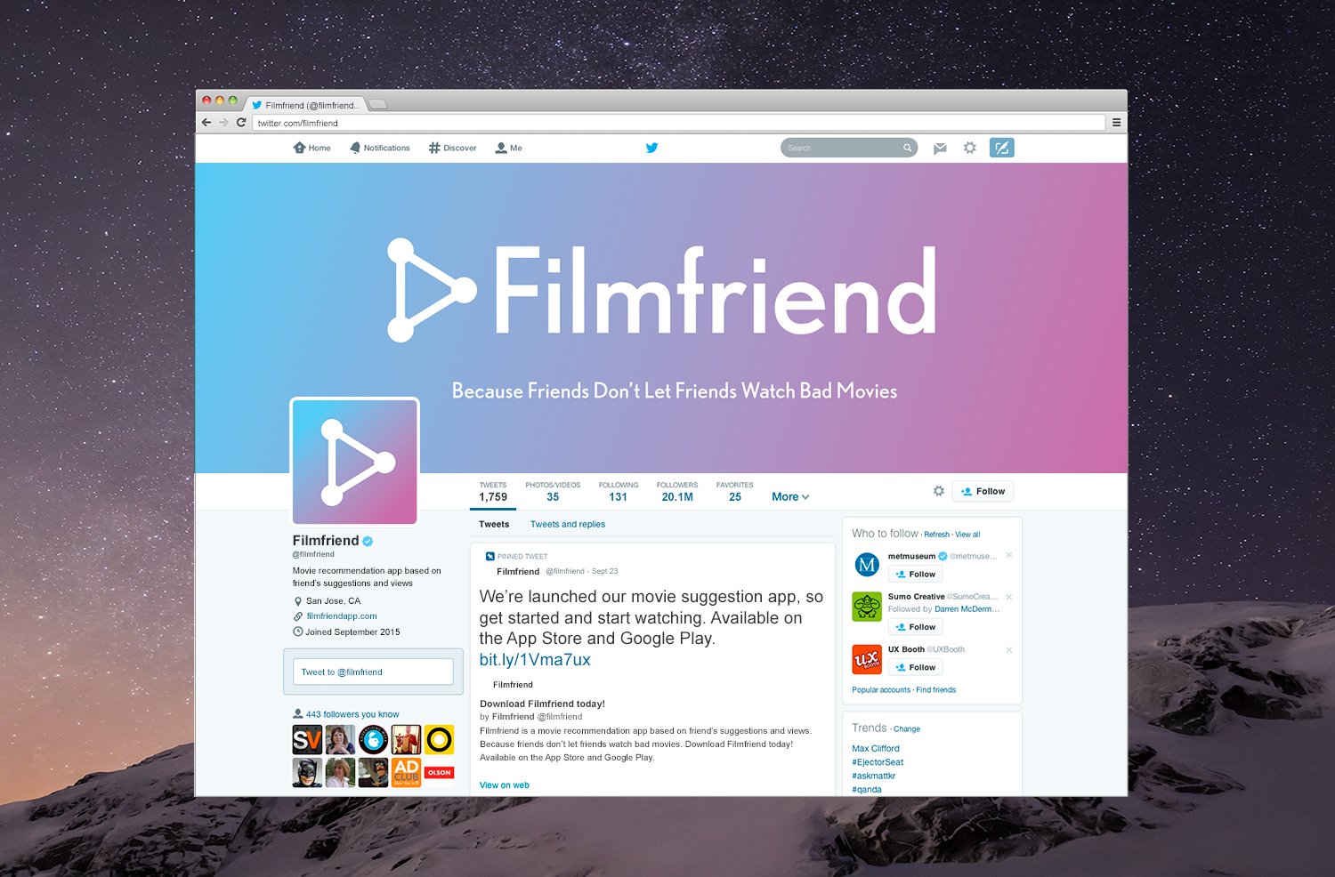
FilmFriend is a fictitious app that recommends films based on friends' suggestions and views. The brand needs a logo and a landing page for the app to show how it works. The logo needs to be simple enough to translate into an avatar on their website and social media platforms.
The logo combines the symbol for sharing on social media with the symbol for play to create a new icon. It is simple enough to read at any size as well as express what the product is. While the app has a lot of graphics, it was important to ground the images to the app so a coloured gradient was implemented.


The Guide
Editorial
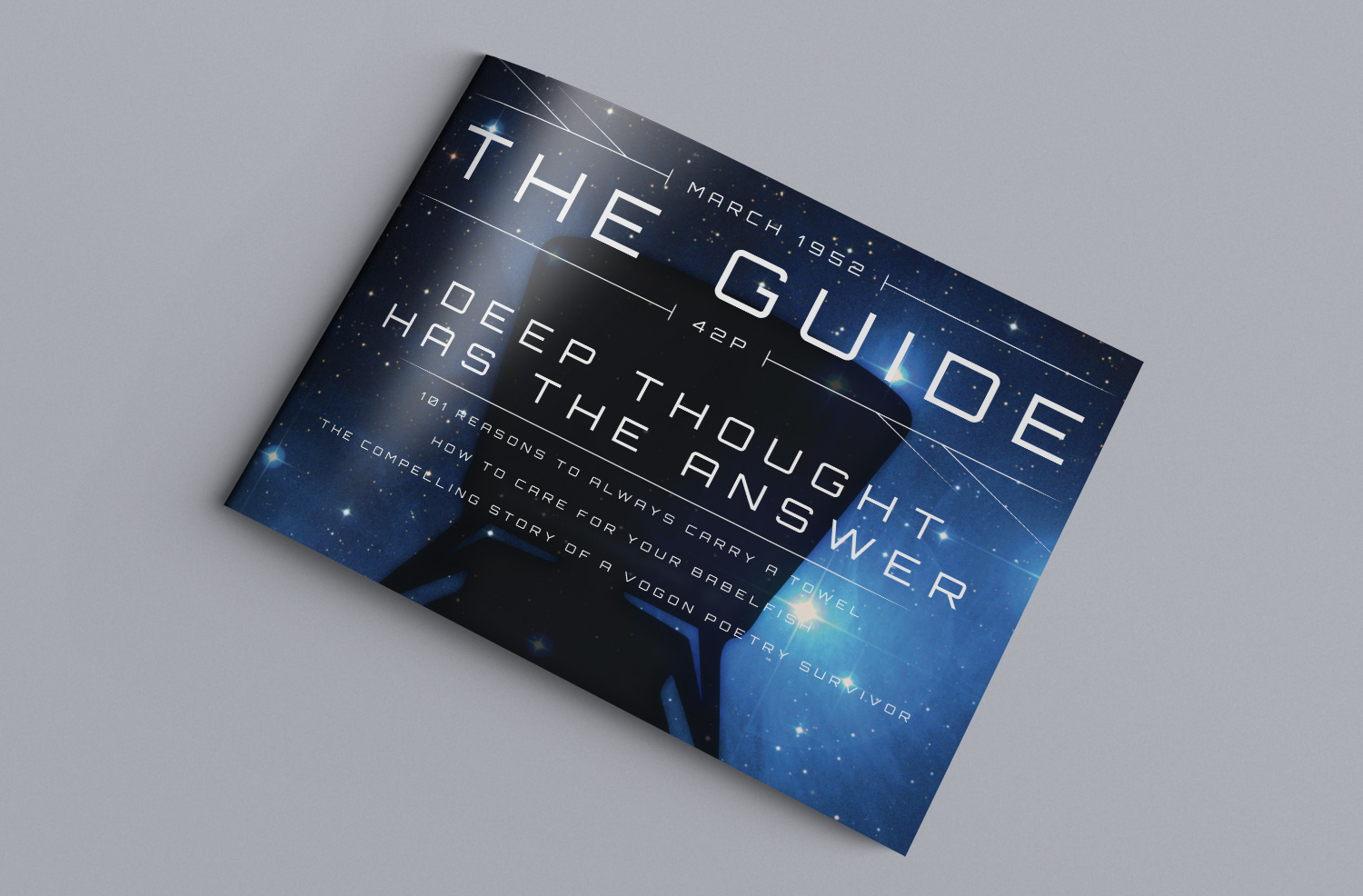
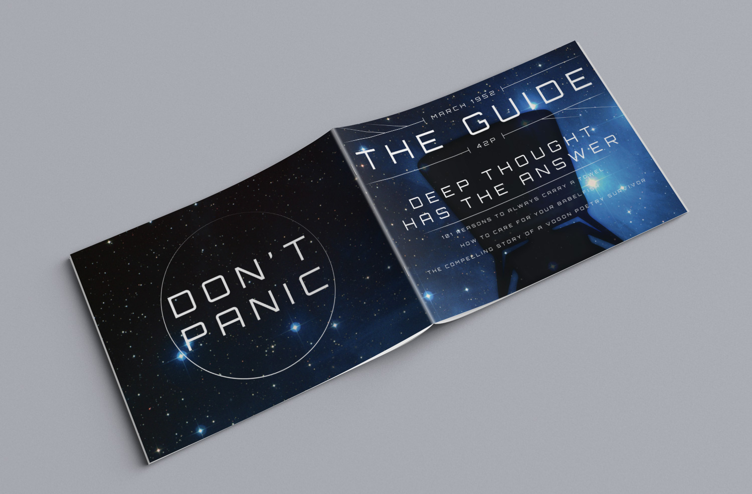
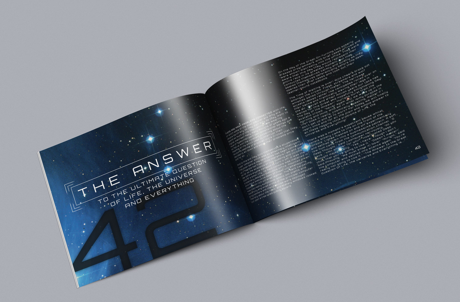
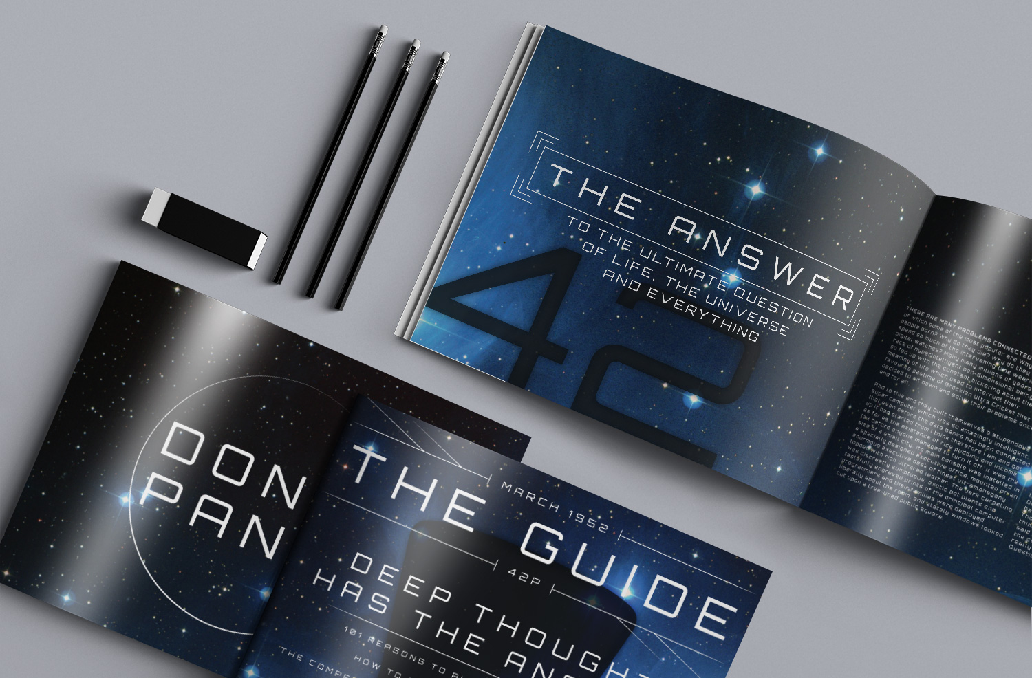
The Guide is a fictitious magazine publication based on Douglas Adams's The Hitchhiker's Guide to the Galaxy. Using lines to help establish hierarchy and theme along with a geometric typeface, the futuristic style appropriately reflects on the subject without being kitschy.
In this personal project, it was important to incorporate references to The Hitchhiker's Guide to the Galaxy. But rather than emulating the graphics from the BBC television adaptation, the graphics used are modern and clean.


Dulcis Gem
Packaging
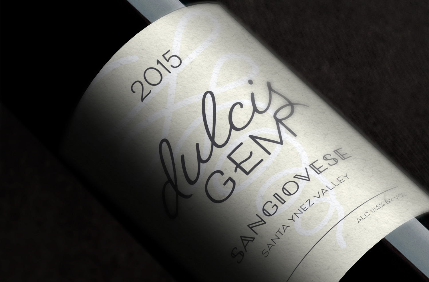
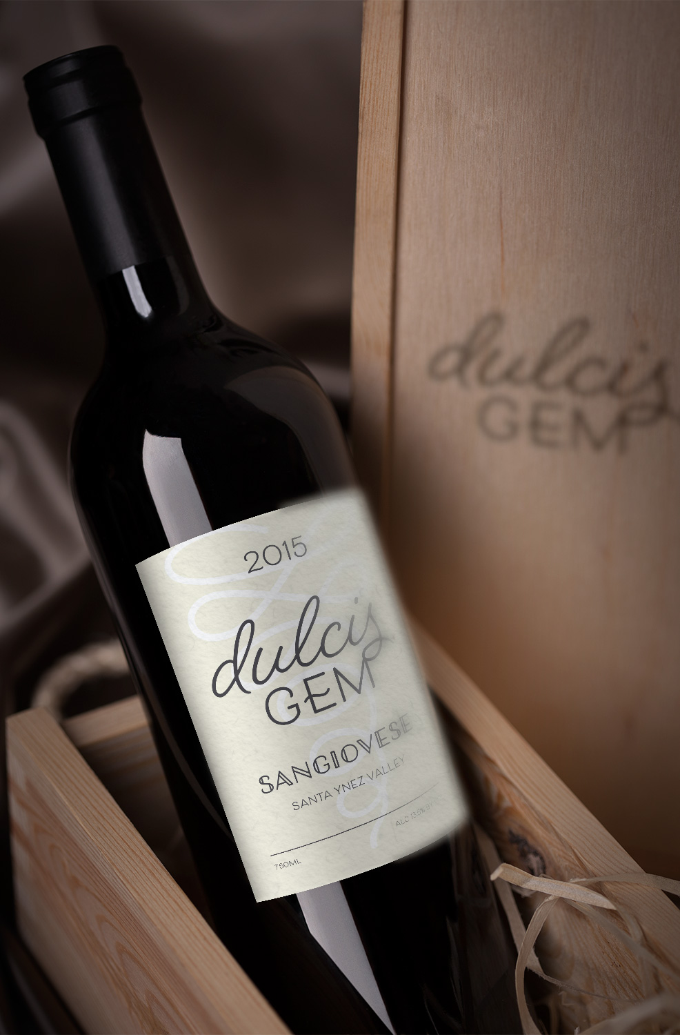
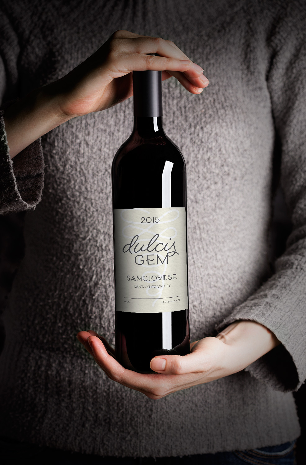
Dulcis Gem is a fictitious wine label producing domestic wine from the Santa Ynez Valley. The label has to stand out from the shelves alongside generic illustrated vineyards. It also has to convey simplicity and contemporary while being legible.
The label remains simple and contemporary by using an ornament background to symbolise grapes. The use of current typography also keeps the label on trend. Those components are enough to make the brand modern without relying on a vibrant colour palette.


Mantri Consulting
Print Design
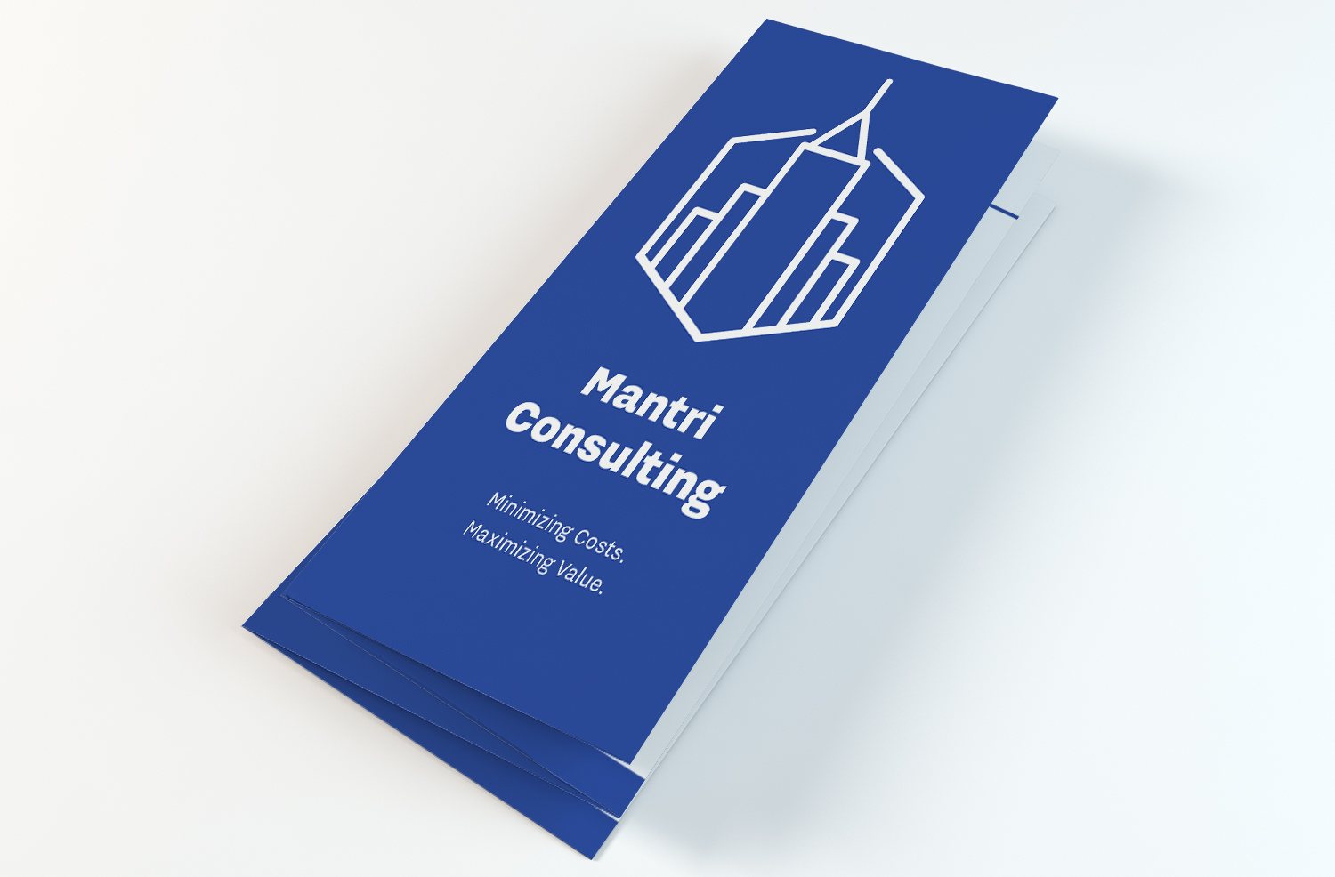
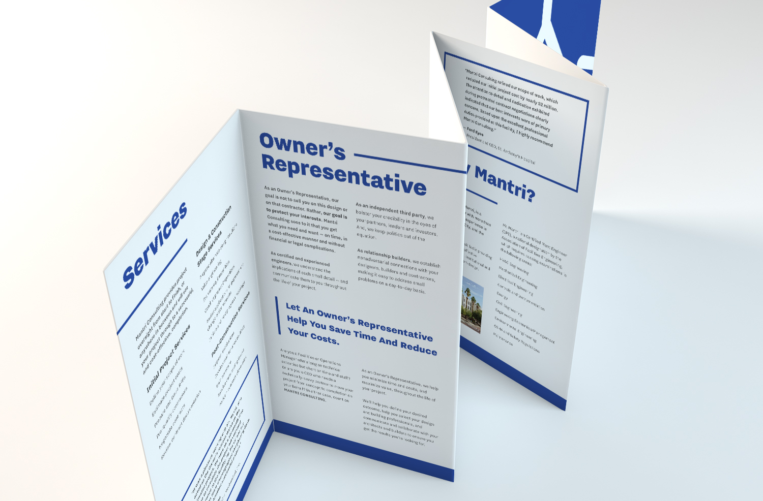
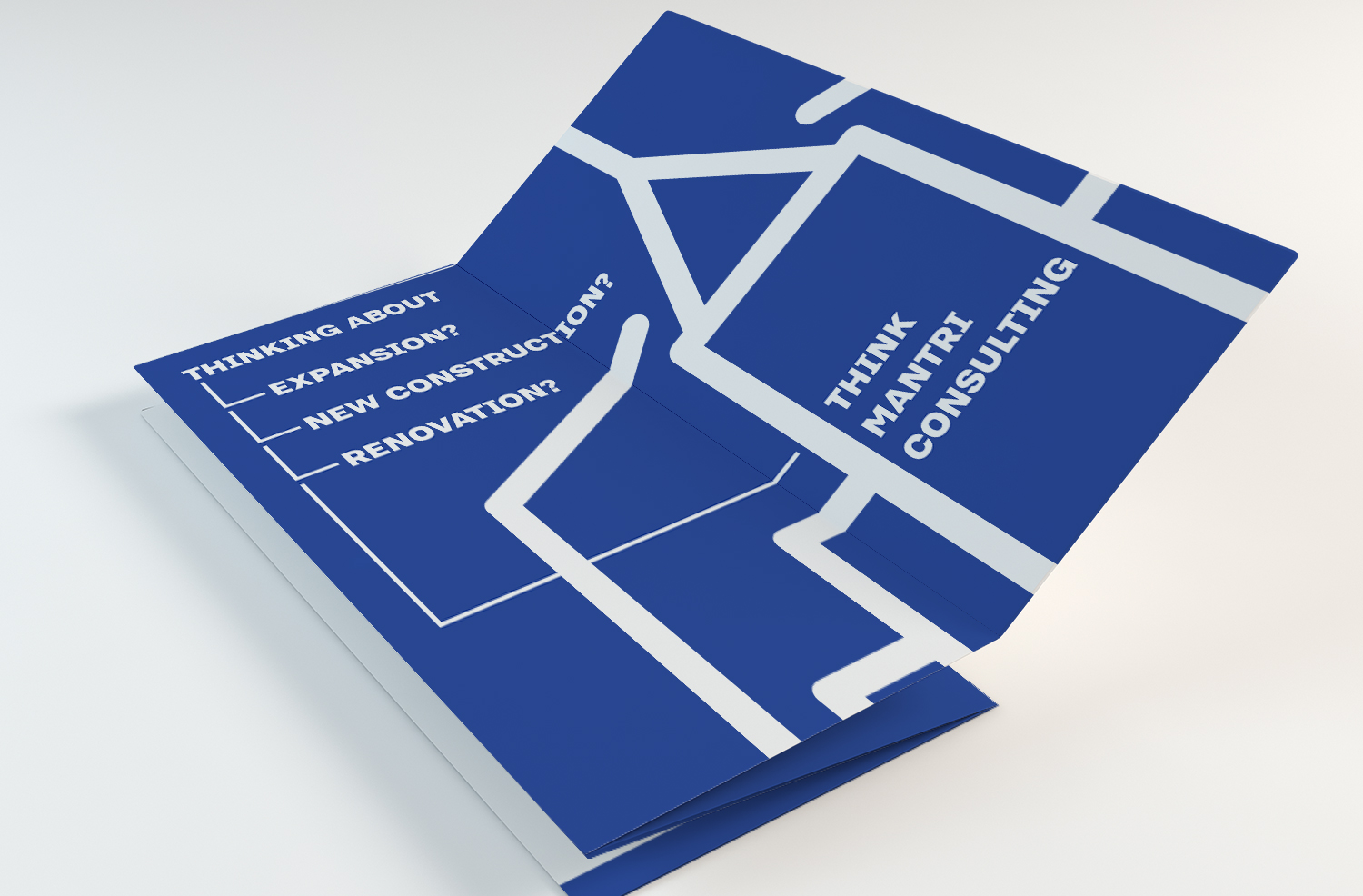
Mantri Consulting is a fictitious engineering consultant firm based in Tampa, Florida. A brochure needs to advertise and promote the company. Content for the brochure includes a list of services, examples, and testimonies.
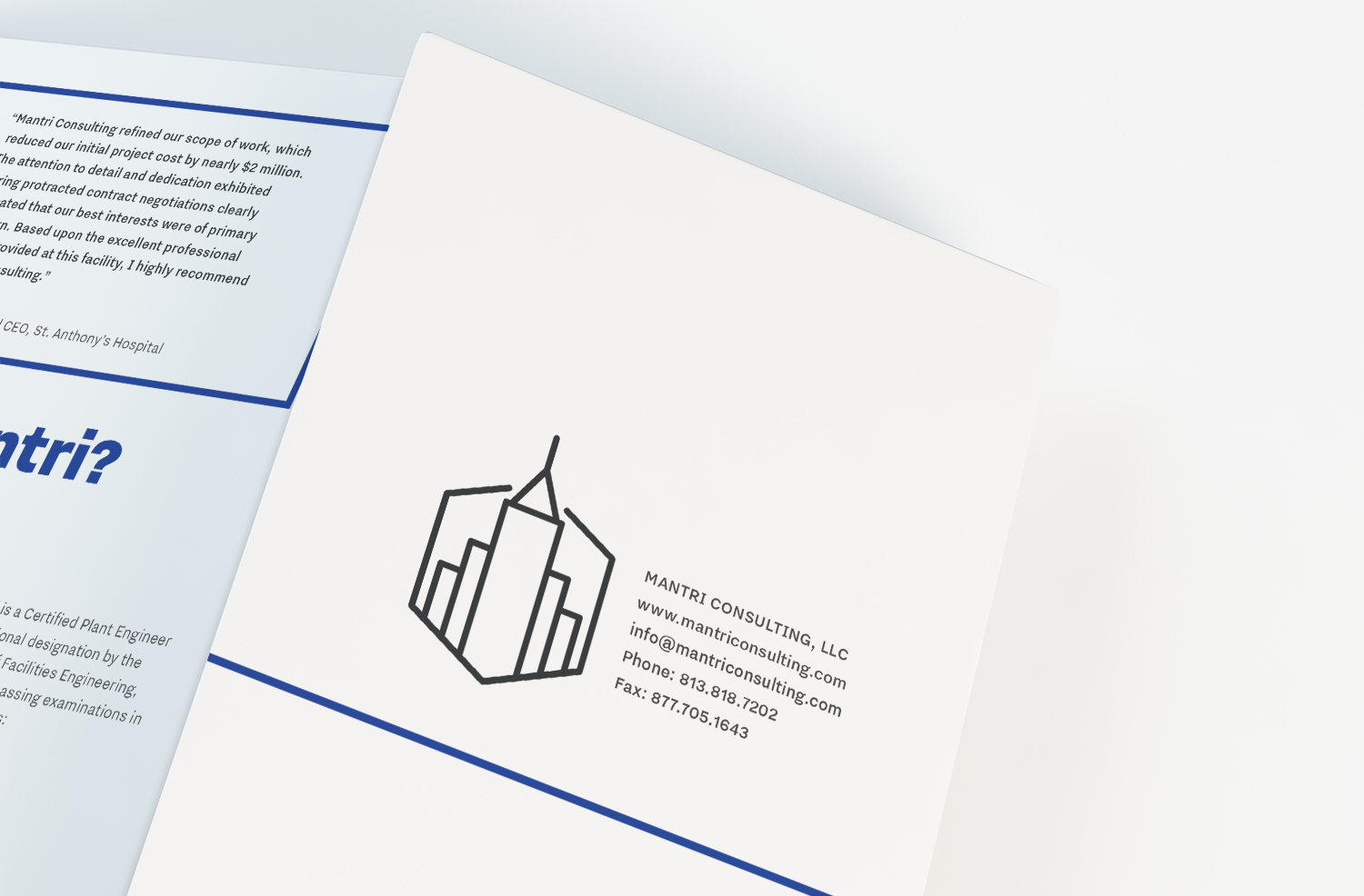
The brochure is simple in design to better convey the information with a linear narrative, sleek lines, and basic colour palette. The colour palette, modeled after blueprint drawings, and font weights help establish a hierarchy. Blue boxes surround testimonies to emphasize them without disrupting the content flow. The logo is also redesigned to make it cleaner and readable at any size.


The Royal Oak Pub
Web Design
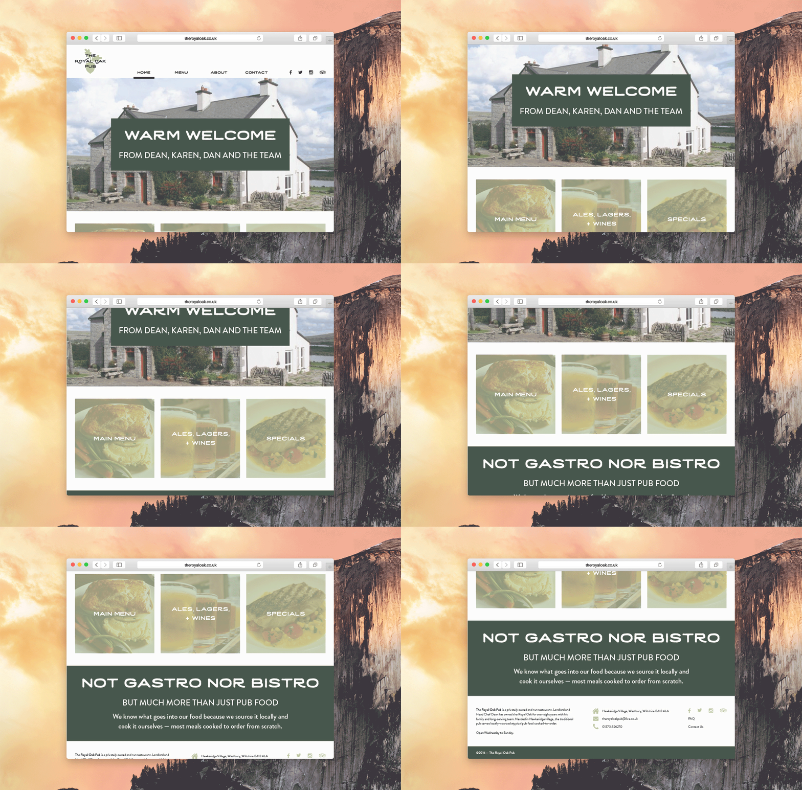
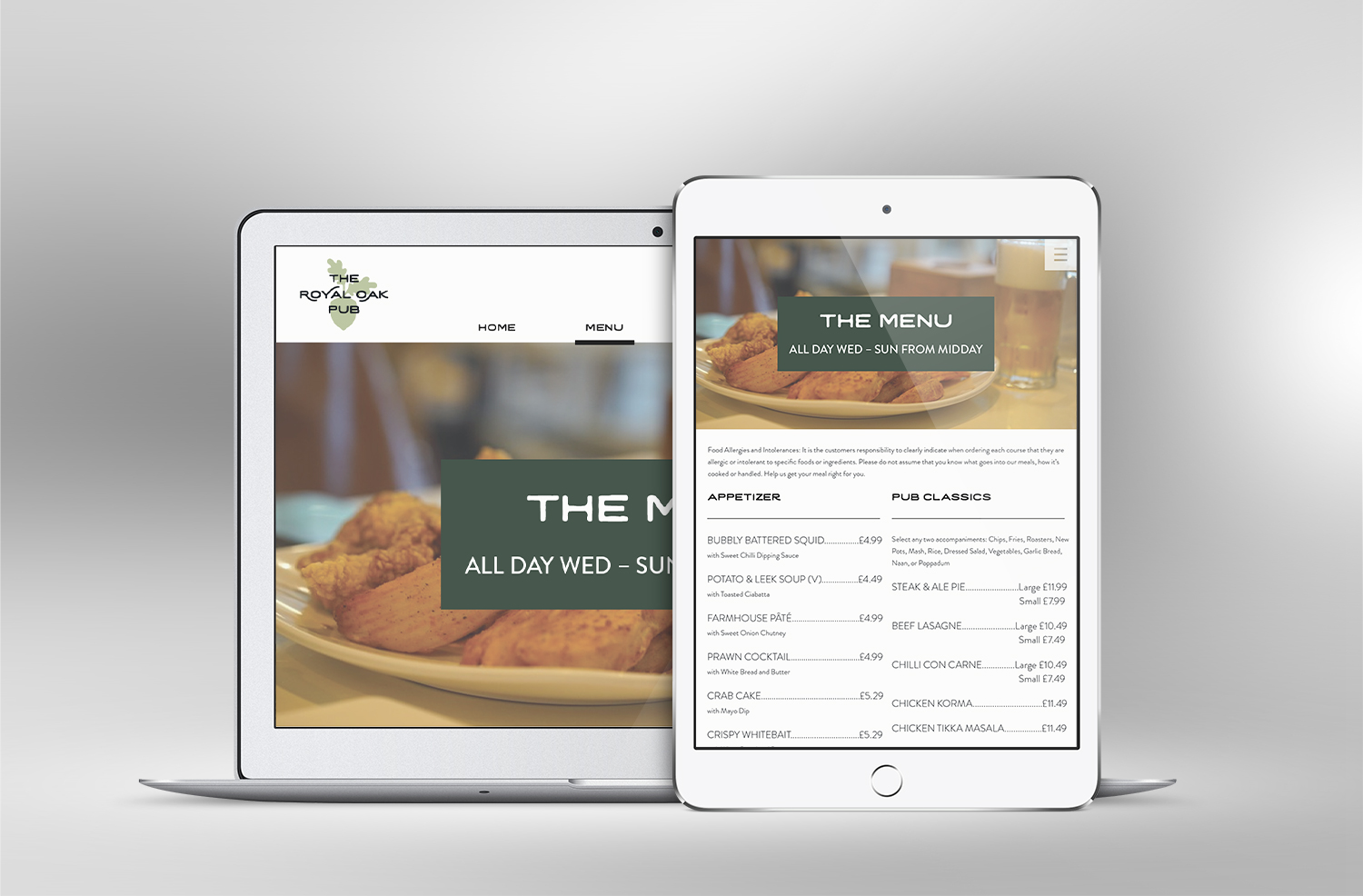
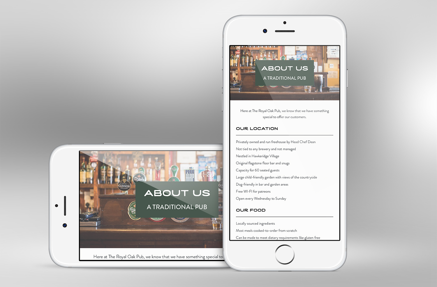
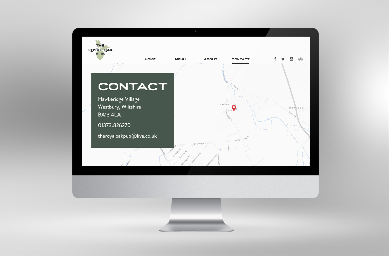
The Royal Oak is a pub and restaurant based in Wiltshire, England run by its owner and head chef. This is an unofficial website redesign that reorganizes the current content. The website should reflect a hand-crafted quality while being simple and responsive in the layout.
White space, typography, and colour palette help organize the content while establishing hierarchy. The logo also had a facelift to make it cohesive to the rustic theme. The basic components of the website from top to bottom are the navigation, banner, content, and footer.


Restaurant Recommendation
Art Direction
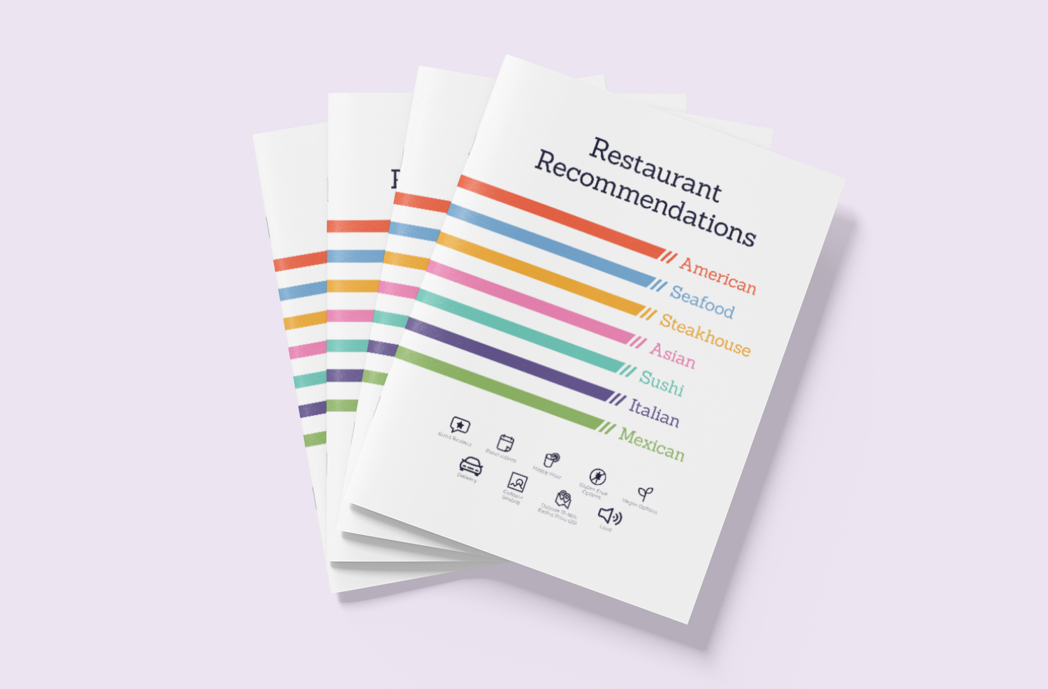
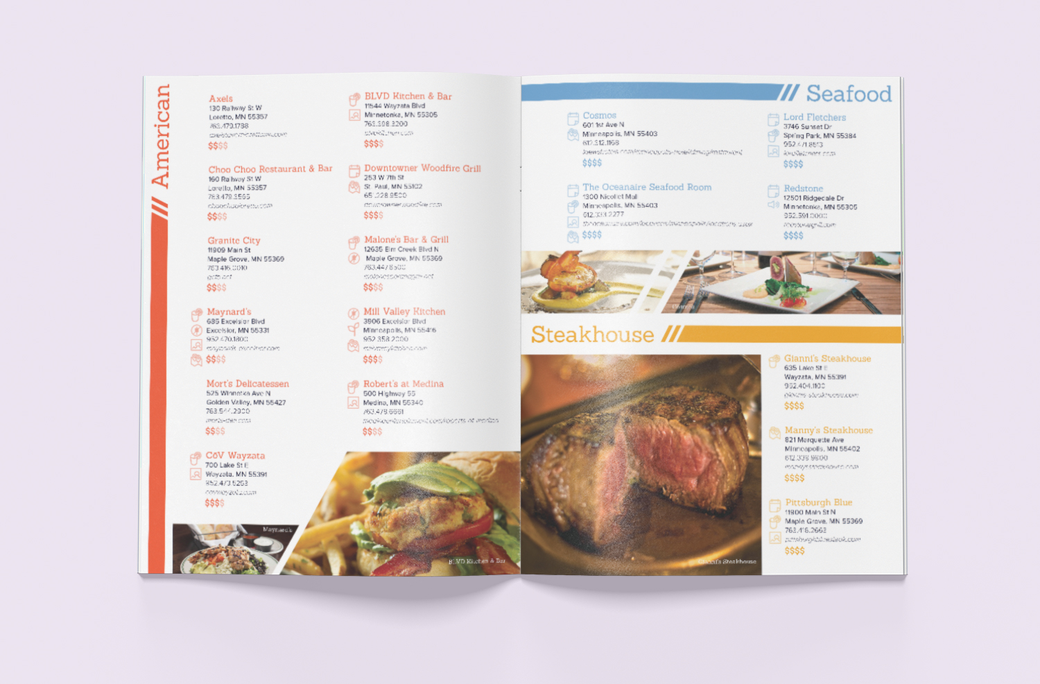
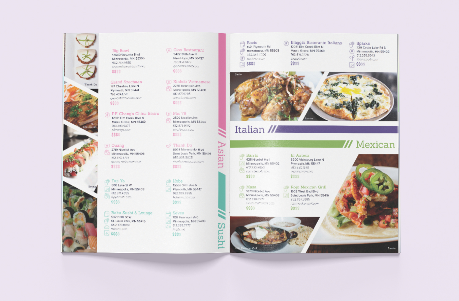
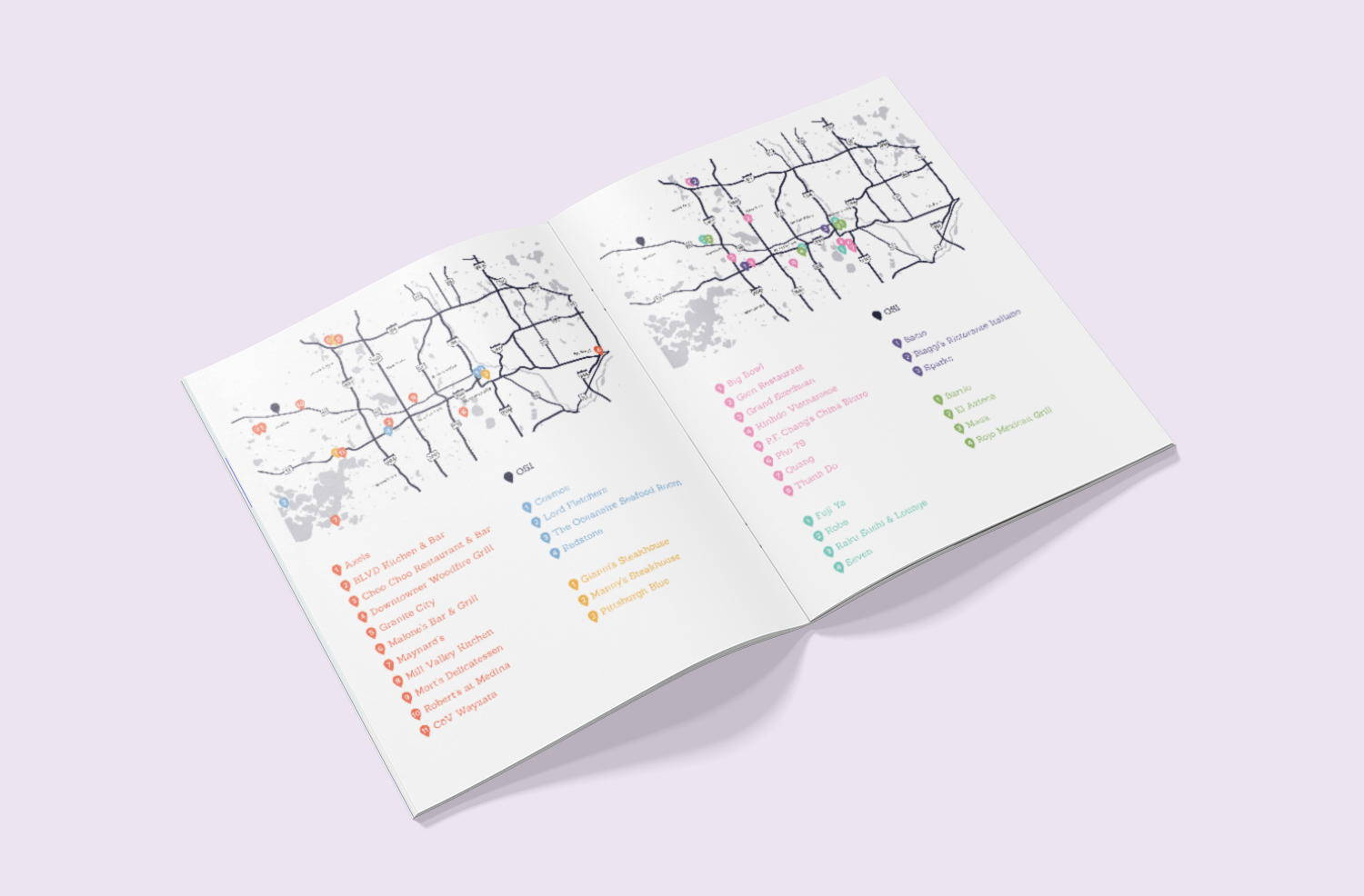
Open Systems International, Inc. (OSI) is a software company specializing in open automation solutions. One of OSI's services includes in-house training. The training department requested a redesign of their restaurant recommendation list for visiting customers.
The goals were the following: organize by cuisine, identify accommodations, incorporate graphics, adhere to company aesthetics, and confirm restaurants are in operation. The solution was a colour-coding rules with icons with a correlating key. The list also includes a map that shows the restaurants in relation to the office.


Rounds
Advertisement
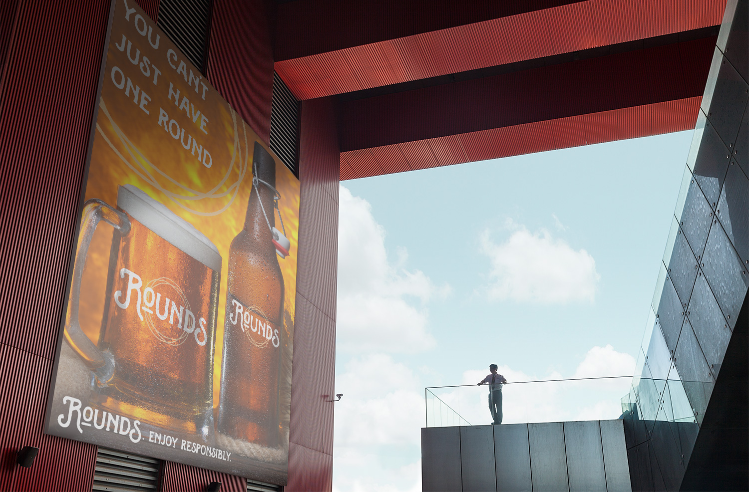
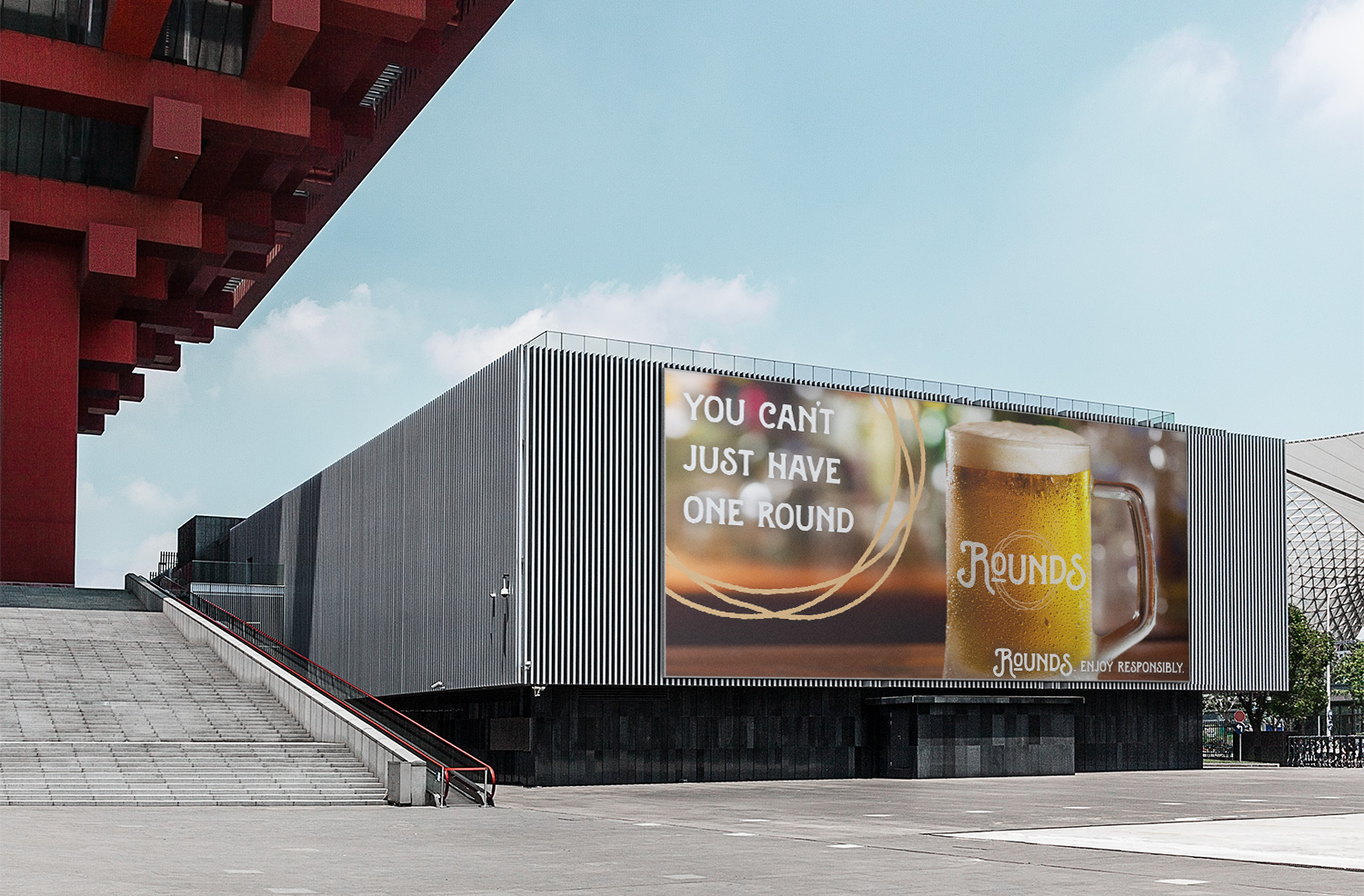
Rounds is a fictitious light beer label that is suitable for continuous consumption. The goal of the advertising campaign is the assert the "you can't have just one round" campaign. The slogan infers to the lightness of the beer while suggesting having rounds of drinks with friends.
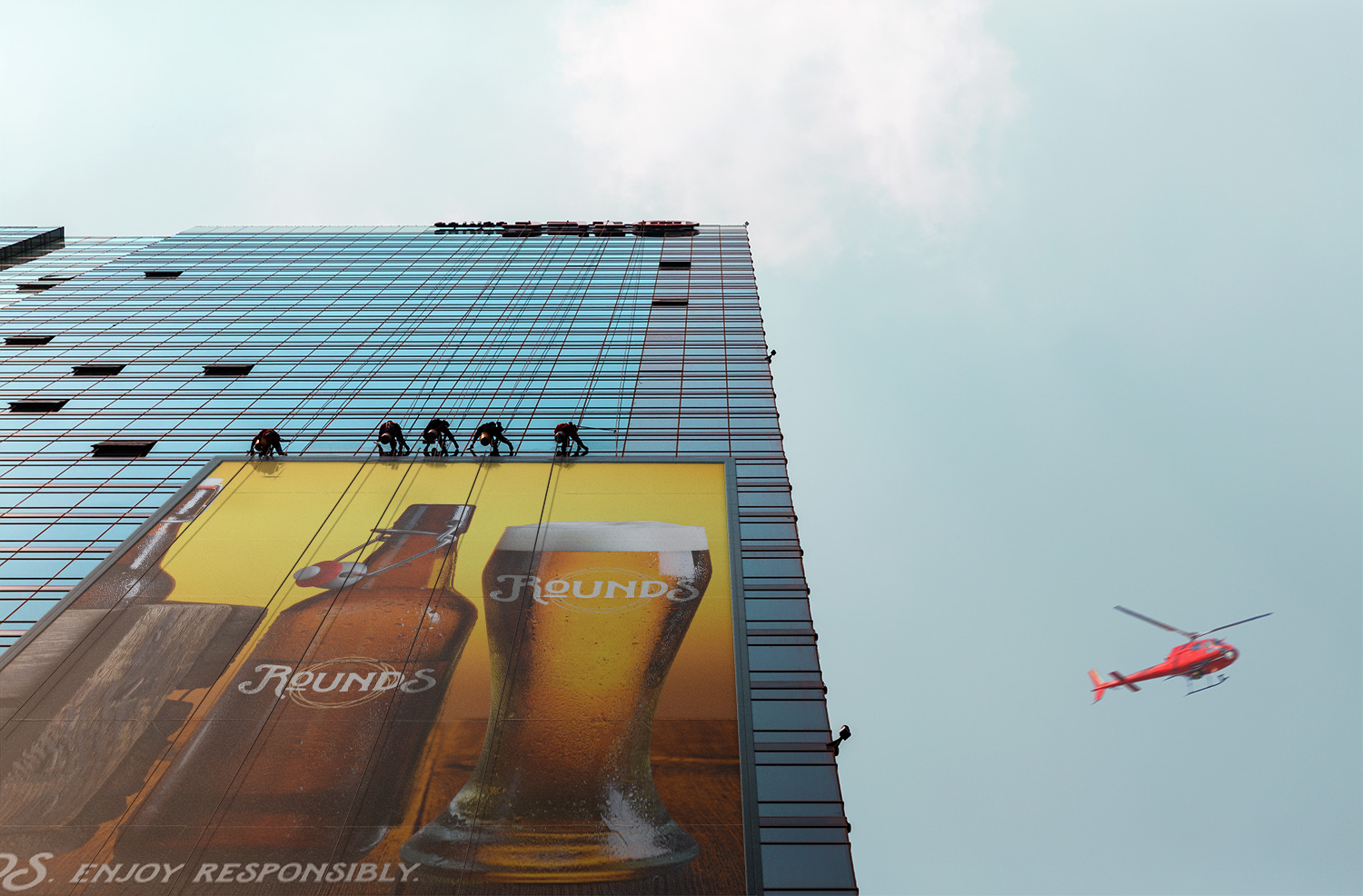
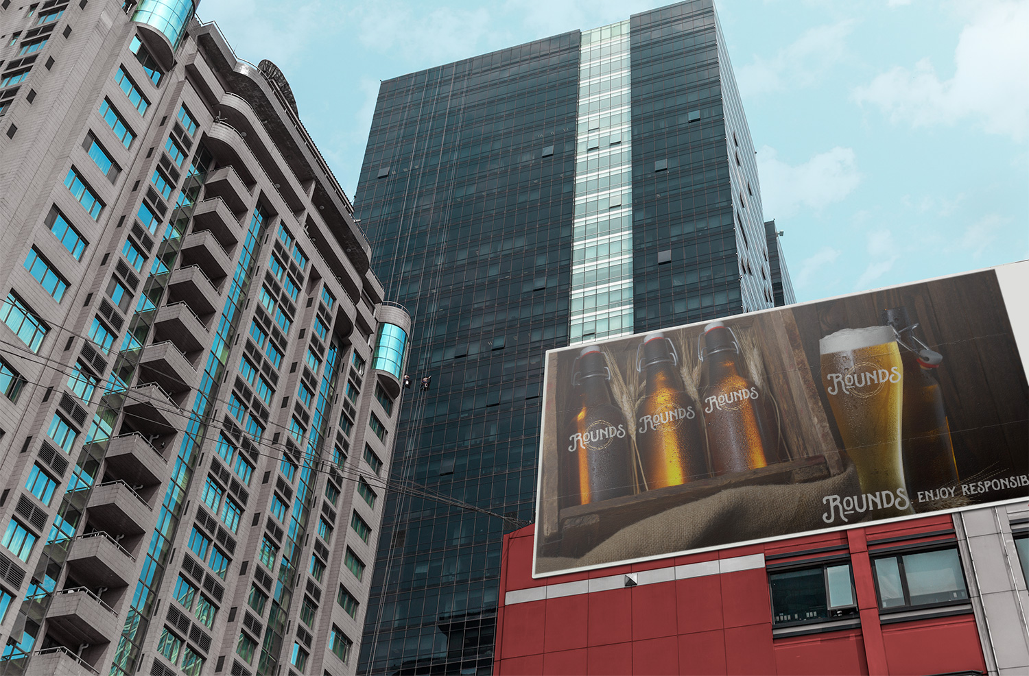
In this personal project, there were two components: the label branding and slogan campaign. The Rounds circle logo is inspired by overlapping wet circle stains after having several beers. After the slogan campaign, the focus becomes to emphasize the simplicity of the beer. Thus, the latter ads focus on the beer and its label instead of pushing the consumers with the prior slogan.
